Framer Padding Hack: Update Spacing Across All Your Project in Seconds

You set padding on dozens of sections and pages in Framer. Now you want to change it everywhere. Manually updating? Nightmare.
The problem? You’re repeating yourself because Framer lacks a central system for padding variables. Every change becomes a tedious “find and replace” across your entire design.
Solution 1: Spacer Component (No Code Needed)
Create an invisible Frame component that acts as a spacer with a fixed width or height. Use this instead of padding everywhere. Want to adjust spacing? Change the spacer’s size once, and every instance updates automatically.
Use variants for Desktop, Tablet, and Phone to handle responsiveness.
Solution 2: Responsive Padding Code Override (Advanced)
Add code overrides that read padding values from global window variables. Change the value in the window object once, and the padding updates instantly on the linked element across your project.
Don’t worry if you can’t code, I’ll explain every step, and ChatGPT’s got your back.
This way you save time, avoid errors, and keep your designs consistent without hunting down every padding instance.
Solution 1: Spacer Component (No Code Needed)
I want to centralize the padding of my Sections, so when I want to change it in the rest of my pages, and for every breakpoint, I only have to do it once.
Step 1: Create a Spacer Component (Visual Padding Control)
-
Make a new empty Frame component called
Spacer. -
Set its default width (or height) to whatever base spacing you want.
-
No background color, no border, just an invisible box.
-
Save it as a reusable component.
Pro tip: Use different Spacer variants for horizontal and vertical spacing if you want, name them Desktop, Tablet and
Step 2: Use Spacer Components Instead of Padding
-
Wherever you want padding inside your layouts or components, drag in your
Spacercomponent. -
For horizontal padding, place Spacer frames on left/right edges.
-
For vertical padding, place Spacer frames on top/bottom edges.
-
Now, adjusting padding means editing the Spacer component’s width or height once, and it updates everywhere.
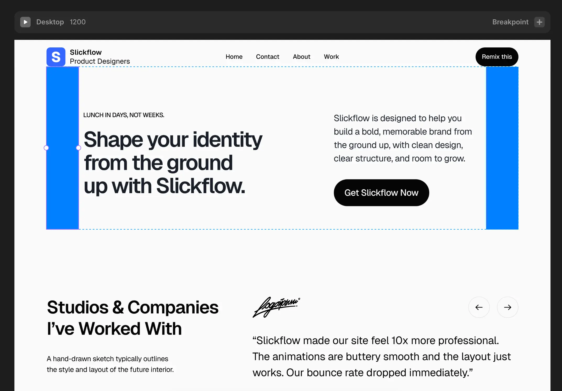
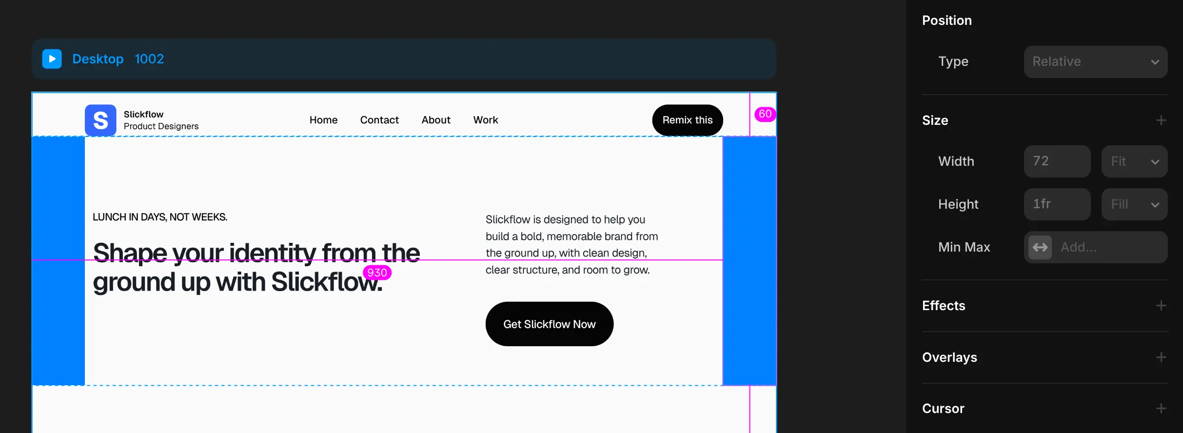
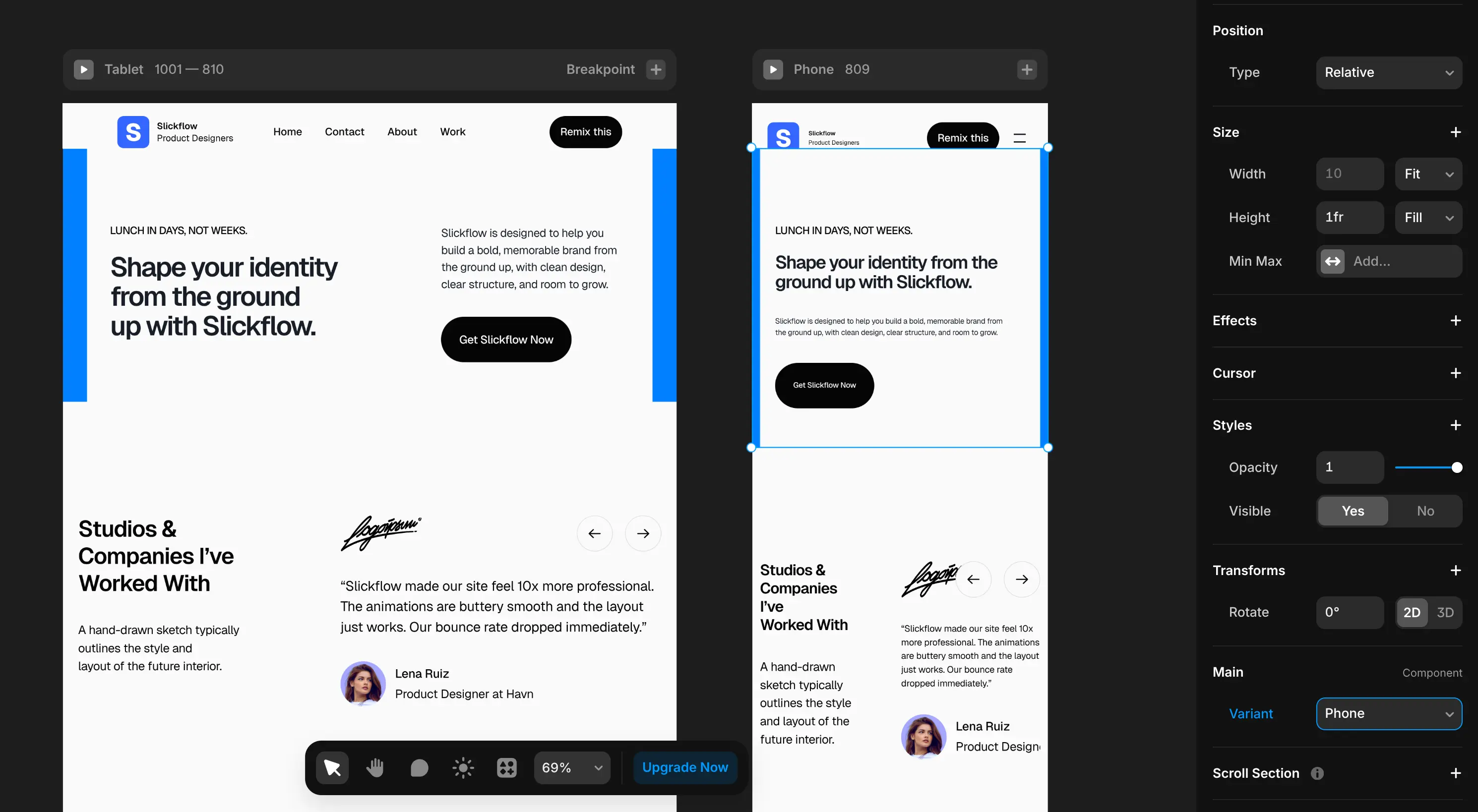
Here you can see it in action: my Section is a stack with side-by-side elements, no padding or gap.
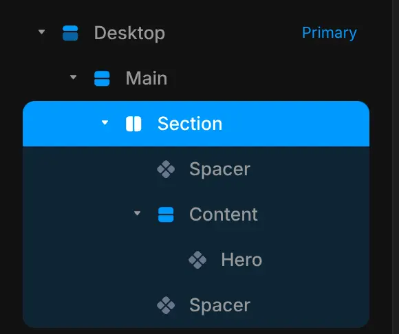
I made the spacer components blue so you can see them clearly.
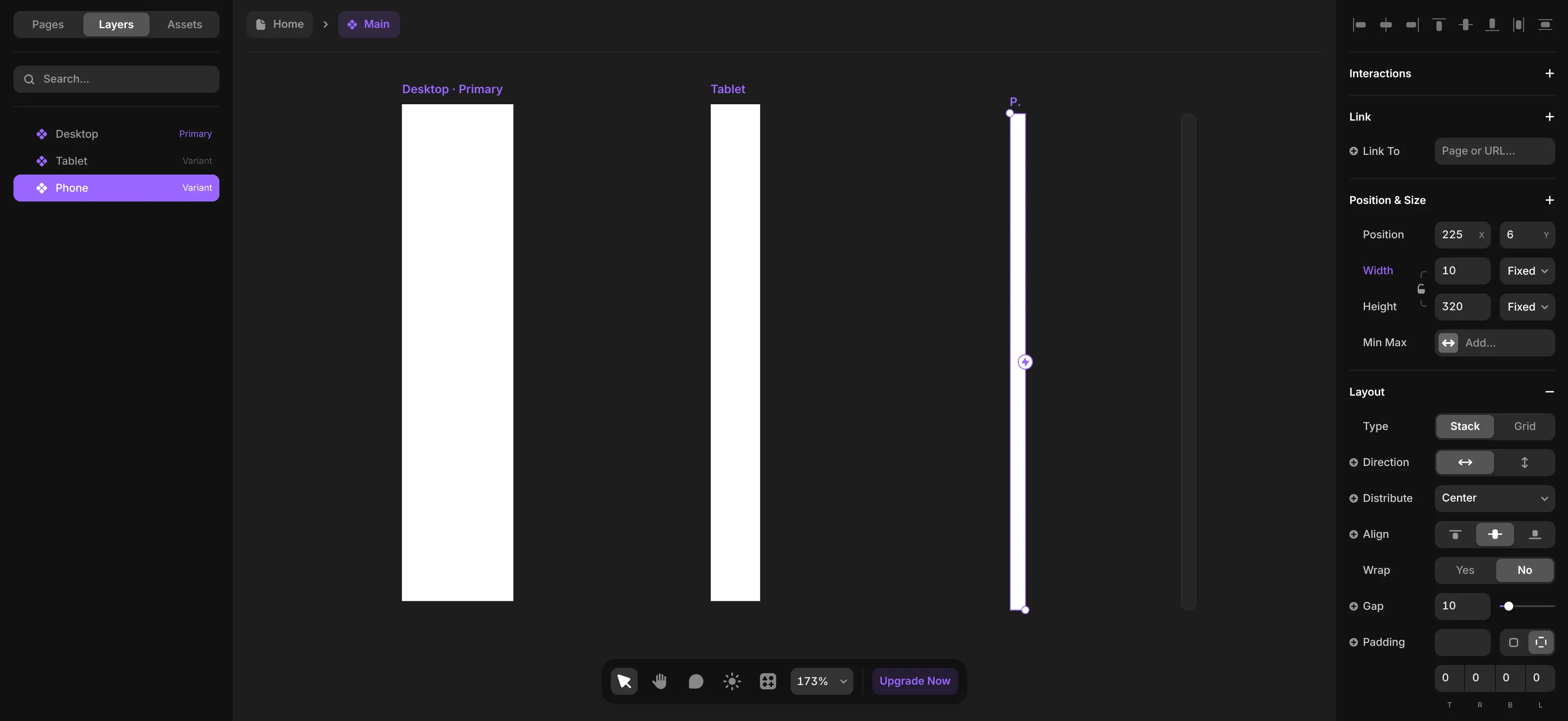
Here are the values for the Spacers.
For each breakpoint, simply switch to the respective variant: Tablet or Phone.
Solution 2: Responsive Padding Code Override (Advanced)
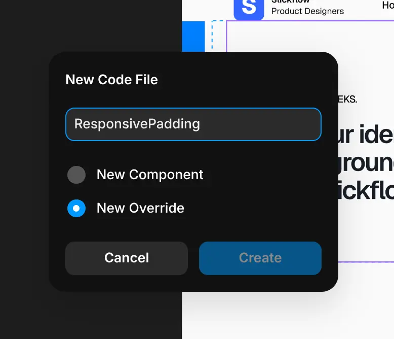
Now I’m gonna go to Assets > Code > Add code and create a New Override file for our code override solution.
Now open your file and replace the default code with this:
import {
    forwardRef,
    type ComponentType,
    useRef,
    useState,
    useEffect,
} from "react"

const MOBILE_WIDTH = 802
const TABLET_WIDTH = 1002

const PADDING = {
    desktop: 150,
    tablet: 72,
    phone: 20,
}

export function withResponsivePadding(Component): ComponentType {
    return forwardRef((props, ref) => {
        const [padding, setPadding] = useState(PADDING.desktop)
        const prevBreakpoint = useRef("desktop")

        useEffect(() => {
            function getBreakpoint(width) {
                if (width >= TABLET_WIDTH) return "desktop"
                if (width >= MOBILE_WIDTH) return "tablet"
                return "phone"
            }

            function updatePadding() {
                const width = window.innerWidth
                const currentBreakpoint = getBreakpoint(width)

                if (currentBreakpoint !== prevBreakpoint.current) {
                    prevBreakpoint.current = currentBreakpoint
                    setPadding(PADDING[currentBreakpoint])
                }
            }

            updatePadding()
            window.addEventListener("resize", updatePadding)
            return () => window.removeEventListener("resize", updatePadding)
        }, [])

        return (
            <Component
                ref={ref}
                {...props}
                style={{
                    paddingLeft: padding,
                    paddingRight: padding,
                }}
            />
        )
    })
}
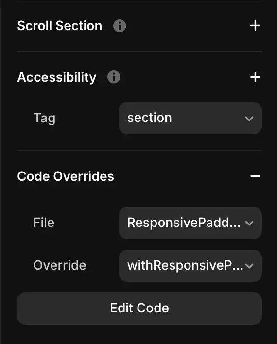
Now I’m going to select one of my Sections and link a code override to it.
Code overrides like this run only in preview or publish mode, Framer’s canvas doesn’t execute override code, so you won’t see the padding changes live inside the editor.
Now you can test it.
How the Responsive Padding Override Works
This override dynamically adjusts left and right padding on your component based on the window width.
It listens to window resize events and updates padding only when crossing defined breakpoints (desktop, tablet, phone) to avoid unnecessary re-renders.
Key Constants and Variables
const MOBILE_WIDTH = 802;
const TABLET_WIDTH = 1002;

const PADDING = {
  desktop: 150,
  tablet: 72,
  phone: 20,
};-
MOBILE_WIDTHandTABLET_WIDTHdefine your breakpoint widths in pixels. -
PADDINGcontains the padding values (in pixels) applied at each breakpoint.
Breakpoint Detection Function
function getBreakpoint(width) {
  if (width >= TABLET_WIDTH) return "desktop";
  if (width >= MOBILE_WIDTH) return "tablet";
  return "phone";
}-
Returns a breakpoint name based on the current window width.
-
You can customize these breakpoints to fit your design.
React Hook for Padding Updates
const [padding, setPadding] = useState(PADDING.desktop);
const prevBreakpoint = useRef("desktop");

useEffect(() => {
  function updatePadding() {
    const width = window.innerWidth;
    const currentBreakpoint = getBreakpoint(width);

    if (currentBreakpoint !== prevBreakpoint.current) {
      prevBreakpoint.current = currentBreakpoint;
      setPadding(PADDING[currentBreakpoint]);
    }
  }

  updatePadding();
  window.addEventListener("resize", updatePadding);
  return () => window.removeEventListener("resize", updatePadding);
}, []);-
Initializes padding state to desktop padding by default.
-
Adds a resize event listener that calls
updatePaddingon every window resize. -
Updates the padding state only if the breakpoint changes (avoids redundant updates).
Applying the Padding Styles
return (
  <Component
    ref={ref}
    {...props}
    style={{
      paddingLeft: padding,
      paddingRight: padding,
    }}
  />
);-
The calculated padding is applied inline as
paddingLeftandpaddingRightstyles on the wrapped component. -
You can add other style properties here if needed.
How to Customize
-
Change padding values: Update the numbers inside
PADDINGto control spacing on each device size. -
Adjust breakpoints: Modify
MOBILE_WIDTHandTABLET_WIDTHto your preferred pixel widths. -
Add vertical padding: Include
paddingTopandpaddingBottomin the style object if you want vertical spacing too.
Important Notes
-
This override only works during preview and published mode; the Framer canvas does not run override code.
-
If you want visual feedback inside the canvas, consider static styles or placeholder components.
That’s it, a lean, flexible, responsive padding override you can use to manage horizontal spacing globally with zero extra spacer components.