How to Build a Draggable Project Slider in Webflow with Splide.js


Webflow’s native slider is fine. But if you’ve ever tried to make it truly draggable on desktop, fully customizable, and easy to control with your own buttons, you’ve hit a wall. That’s where Splide.js comes in.
In this tutorial I’ll show you exactly how to set up a smooth, draggable slider in Webflow using Splide.js, with custom navigation buttons, responsive breakpoints, and no plugins required.
Let’s get into it.
Step 1: Set up your card structure in Webflow
Before touching any code, you need a card to slide. Add a Div Block to your page and design your card inside it, image, title, description, whatever your project needs. Keep it simple for now, you can always refine the design later.
Once your card looks good, you’re ready to wrap it in the Splide structure.
So, this is my card.
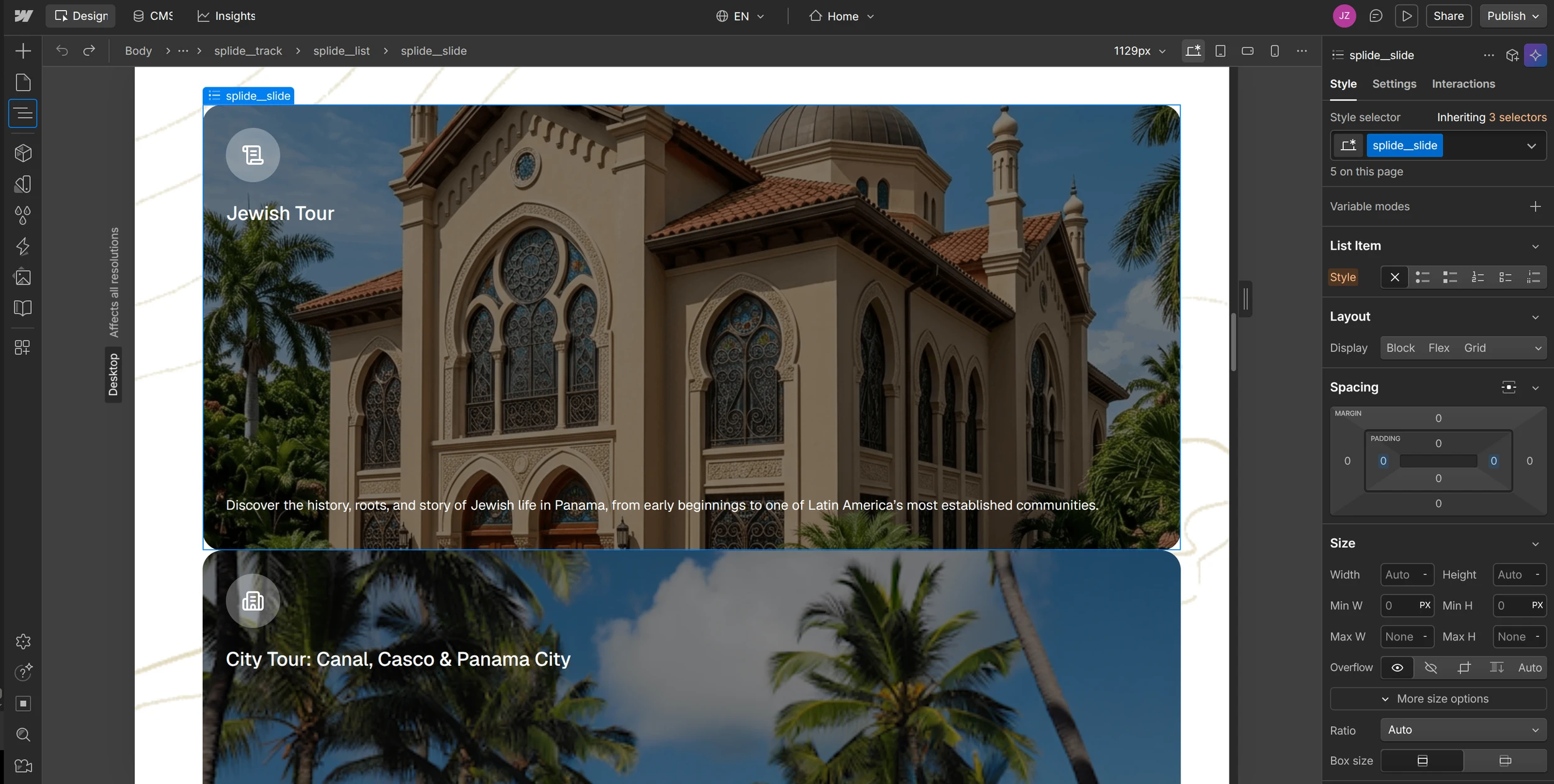
The card has a width of 100%, which is fine. Splide will handle it later.
Step 2: Wrap Your Card in the Splide Structure
Now that your card is ready, it’s time to tell Splide what to slide.
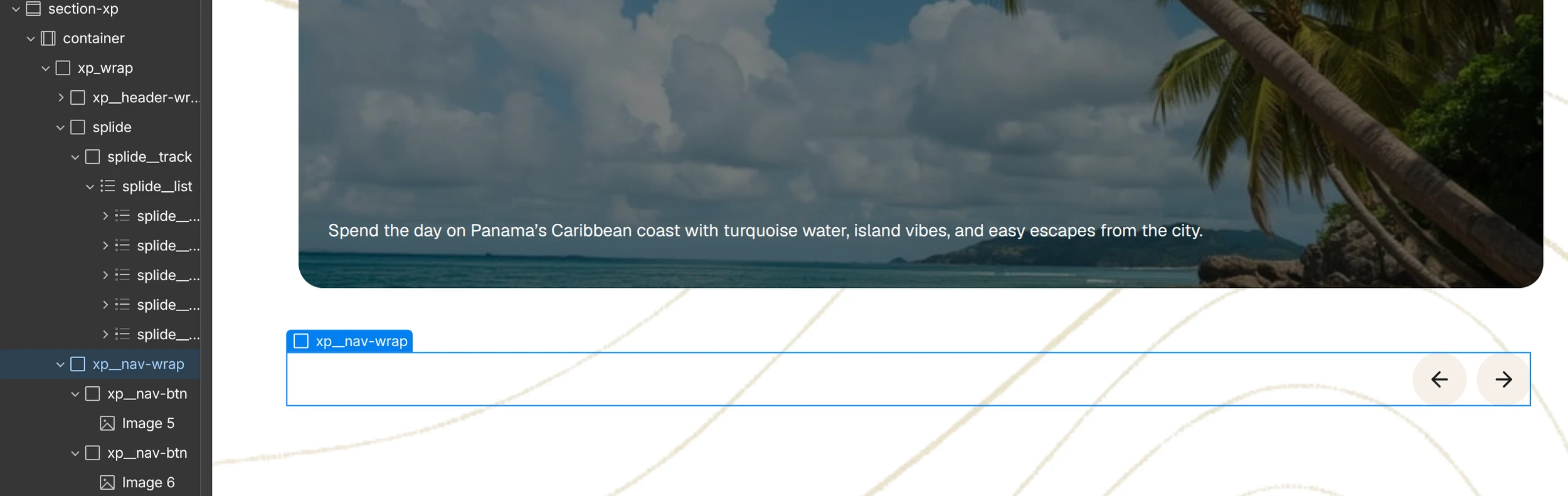
Splide needs a very specific HTML structure to work. Two nested Div Blocks and a webflow list element.
- splide — the outer wrapper
- splide__track — the scroll container
- splide__list — the actual list of slides
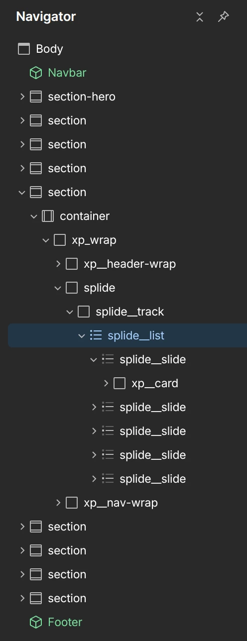
Create a div and give it the class splide.
Inside the new splide div, create another div with the class splide__track.
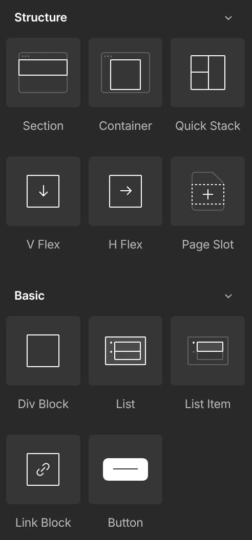
Inside splide__track, add a Webflow List element. You can find it in the Basic section of the Elements panel.
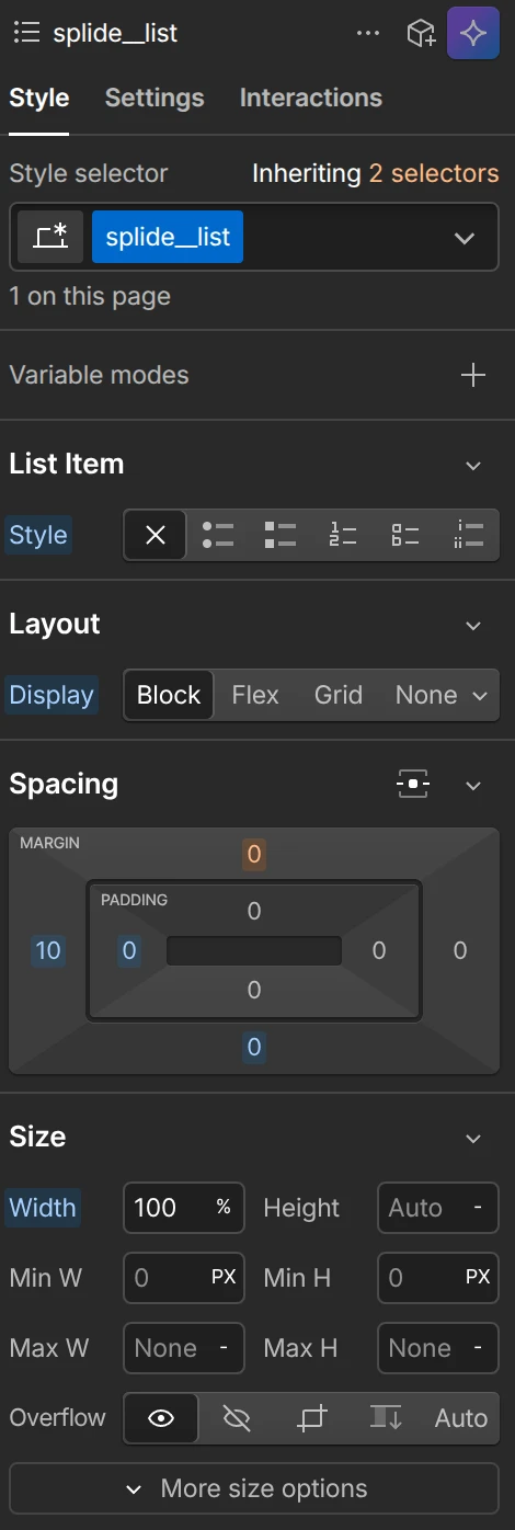
Give that List element the class splide__list.
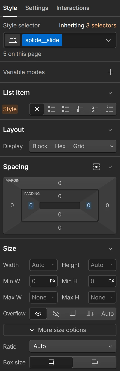
Then, each list item (li) should have the class splide__slide.
Inside each splide__slide, place your cards.
Give each div its class name exactly as shown, Splide is case sensitive and won’t work if the class names are off.
Once the structure is in place, duplicate your card a few times inside splide__list so you have something to actually slide through.
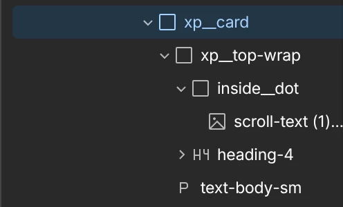
The styles of splide__list
and splide__slide
At the bottom, you can see the div with the class xp__nav-wrap. It contains the two xp__nav-btn buttons, each with an icon inside.
We’re going to hide Splide’s default controls with CSS so we can use our own custom navigation buttons instead.
Step 3: Add Splide via CDN
Before Splide can do anything, you need to load its CSS and JavaScript. In Webflow, go to Pages → Page Settings for the page you’re working on, or use Site Settings if you want it available everywhere.
Paste this in the Head Code section:
<link rel="stylesheet" href="https://cdn.jsdelivr.net/npm/@splidejs/splide@4.1.4/dist/css/splide.min.css">

<style>
  .splide__arrows { display: none; }
  .splide__list {
    display: flex !important;
    gap: 0 !important;
    row-gap: 0 !important;
  }
  .splide__pagination {
    display: none;
  }
</style>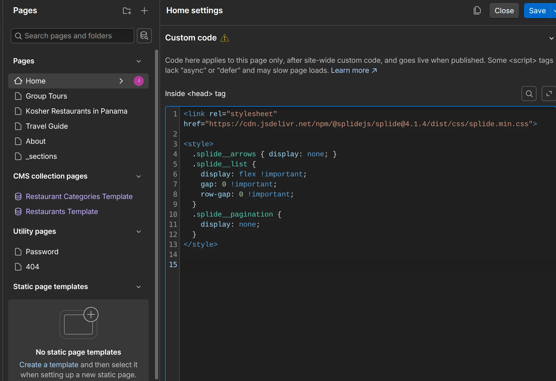
Then paste this in the Footer Code section:
<script src="https://cdn.jsdelivr.net/npm/@splidejs/splide@4.1.4/dist/js/splide.min.js"></script>
<script>
  const splide = new Splide('.splide', {
    type: 'loop',
    perPage: 3,
    drag: true,
    gap: '20px',
    arrows: false,
    breakpoints: {
      768: { perPage: 1 },
      1024: { perPage: 2 },
    }
  }).mount();

  document.querySelector('.slider-prev').addEventListener('click', () => splide.go('<'));
  document.querySelector('.slider-next').addEventListener('click', () => splide.go('>'));
</script>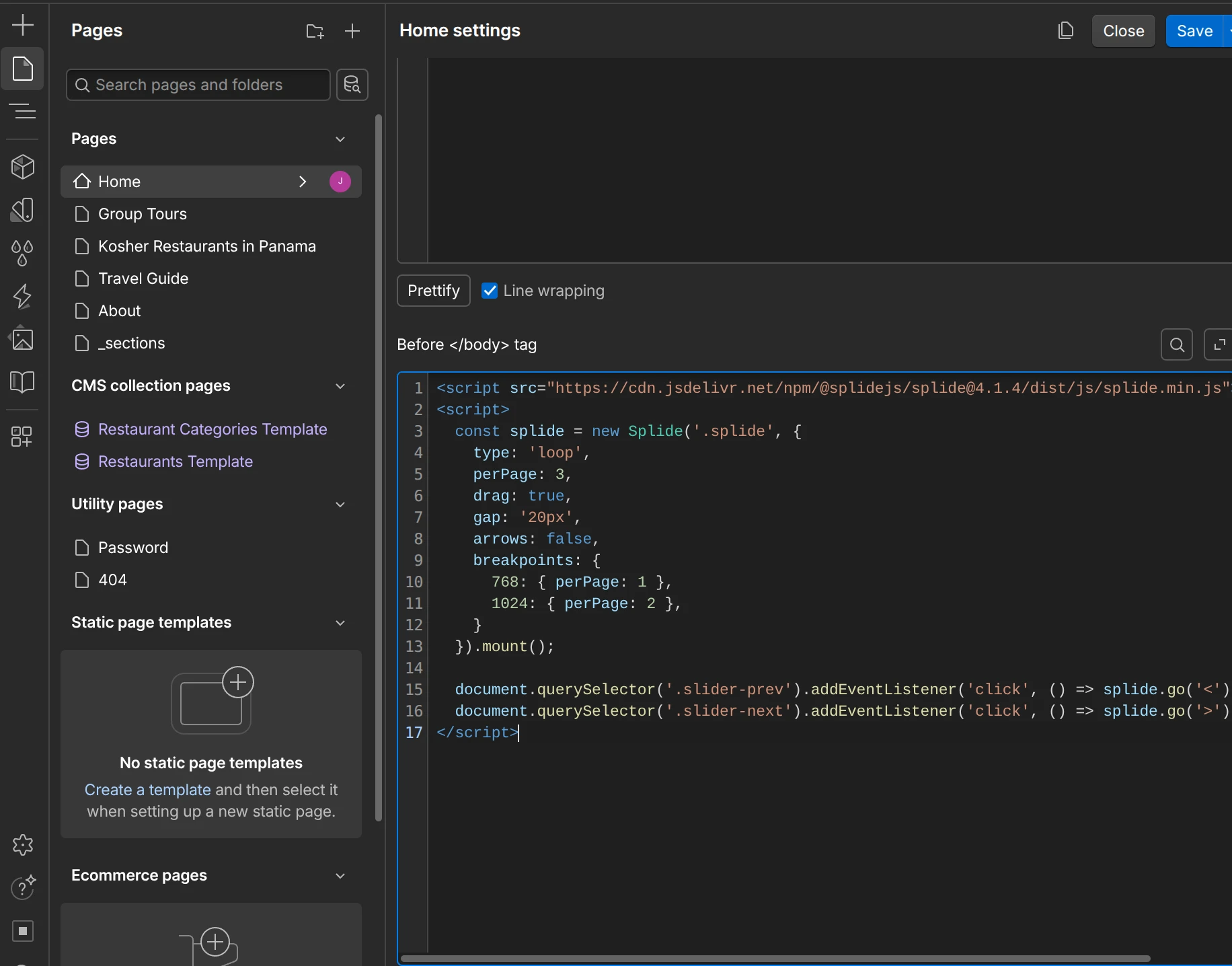
Now save your changes, publish the site, and you’re ready to start using it.